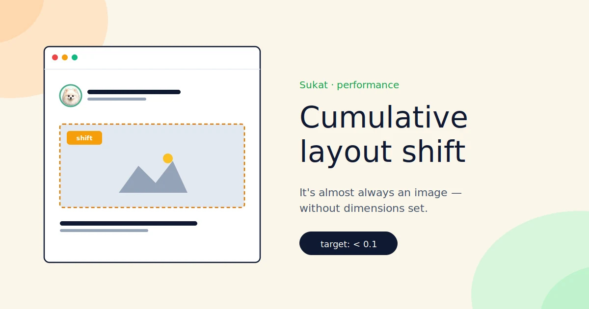
Most CLS problems come down to the same thing: images without explicit dimensions in the HTML.
The text loads, the user starts reading, then the image arrives 800ms later and shoves everything down two hundred pixels. That jump is the layout shift. The browser had no way to know how tall the image would be, so it laid the page out without reserving space, then re-laid it out the moment the image returned.
What CLS measures
Cumulative Layout Shift is the sum of every unexpected layout movement on a page from load to interaction. Google's thresholds:
- Under 0.1: good
- 0.1 to 0.25: needs work
- Over 0.25: bad
A single big jump — a 50%-viewport-height hero arriving late — can push a score past 0.25 on its own. That's why CLS problems often look mysterious. One slow image is enough.
Why images are the usual cause
The browser lays out the page in a single pass when it receives the HTML. To place an image in that pass, it needs to know how tall to make the box. There are three places that height can come from:
- An explicit
widthandheightattribute on the<img>tag - An explicit
aspect-ratioin CSS - The image itself, once it's downloaded
If the first two are missing, the browser falls back to the third. Which means it lays out the page without reserving space for the image, then re-lays it out when the image arrives. That re-layout is your CLS.
The fix is dimensions in the HTML. Always. There's no good reason to skip them anymore.
The advice you may have read is out of date
For years the prevailing wisdom in responsive design was to omit width and height from <img> tags and let CSS handle sizing. That worked, but it made CLS unsolvable, because the browser had no dimensions to reserve.
Around 2020 the browser vendors changed how those attributes are interpreted. They no longer fix the rendered size — they compute an aspect ratio, which the browser uses to reserve space at any rendered width. You can keep max-width: 100%; height: auto in your CSS and put real pixel dimensions in the HTML. They work together now.
If your codebase still has bare <img src="…"> tags, that's where to start.
How Sukat helps
Sukat doesn't fix your HTML for you — that's a templating job. But two adjacent problems show up alongside CLS, and Sukat addresses both.
The first is image weight. CLS gets worse as images load later, which means heavier images cause bigger shifts even when dimensions are correct, because the user has more time to start reading before the image arrives. Drop a hero from 1.5 MB to 200 KB and the shift window collapses with it.
The second is auditing. Sukat Inspector is a Chrome extension that audits every image on a page and flags ones missing dimensions, oversized for their rendered size, or in inefficient formats. It's the fastest way to find the images causing your CLS without reading the rendered HTML by hand.
For CLS work, the workflow is:
- Run PageSpeed Insights. Note the CLS score and the specific elements flagged.
- Open Inspector on the page. Anything in the Page Images panel with missing dimensions is a CLS suspect.
- Add
widthandheightto the offending<img>tags in your template. - While you're there, compress anything Inspector flagged as oversized through Sukat.
What the fix actually looks like
Take a common pattern: a WordPress site sitting at CLS 0.34, where the homepage hero, three feature cards, and a logo strip are all bare <img> tags with no dimensions. Adding width and height to each of them in the theme template — no other changes — drops the score to 0.04. One commit.
Other sites have more stubborn CLS. Late-injected ad slots, fonts that swap and reflow body text, cookie banners that push everything down — image dimensions alone won't fix those. But images are usually the dominant cause and the cheapest to fix. Start there.
A note on caching plugins
One trap worth flagging if you're on WordPress. Some caching plugins serve pre-built HTML that bypasses your PHP filters entirely. If you've written an add_filter hook to inject width and height into <img> tags and CLS hasn't budged, check whether your caching layer is even running that filter on cached pages.
Most caching plugins have a native option to add image dimensions during cache generation. Use that instead of a custom filter — it runs at the right point in the pipeline, after the cache has been built rather than before.
The summary
CLS is almost always images without dimensions. Add the attributes, compress the heavy ones, and watch the score drop. If it doesn't, you have ads, fonts, or late-injected content to chase — but rule out the easy fix first.
If your CLS has been stuck above 0.1, start there.
Frequently asked questions
What CLS score counts as good?
Google rates a Cumulative Layout Shift under 0.1 as good, 0.1 to 0.25 as needing work, and over 0.25 as bad. A single late-arriving hero — say one filling half the viewport height — can push a page past 0.25 on its own, which is why CLS problems often look mysterious.
Why are images the usual cause of layout shift?
The browser lays out the page in one pass when it gets the HTML, and to place an image it needs a height. That height comes from an explicit width and height attribute, an aspect-ratio in CSS, or the downloaded image itself. If the first two are missing, the browser lays out without reserving space and re-lays out when the image arrives — that re-layout is your CLS.
Doesn't responsive CSS mean I should leave width and height off?
Not anymore. Around 2020 browsers changed how those attributes are read: they no longer fix the rendered size, they compute an aspect ratio used to reserve space at any width. You can keep max-width:100%; height:auto in CSS and put real pixel dimensions in the HTML — they work together now.
I added the dimensions and CLS still hasn't moved. What's wrong?
If you're on WordPress, some caching plugins serve pre-built HTML that bypasses your PHP filters, so an add_filter hook that injects width and height never runs on cached pages. Use the caching plugin's native add-image-dimensions option instead — it runs after the cache is built. If it's still stuck, chase late-injected ads, font swaps, or cookie banners.
About Sukat
Sukat builds free, privacy-first browser tools for compressing images and verifying published content. Everything runs in your browser — nothing is uploaded.